Tuesday, October 27, 2009

Ellington Robinson

I recently went to the Paul R. Jones Collection at the University of Delaware.  It is very thought provoking, but I found the two artists that struck me the most are Frank Bowling and Ellington Robinson.  Bowling's piece that is featured is called "Boo'sback" and it relates to African American music.  Bowling's work is very similar to Robinson's as well because it focuses on African American music.  I wish I could show the pieces that are featured by Robinson that are in the Collection, but I could not find a photo of it on the Internet (go figure right).  However, I did pull this image off of Google and it is called "No Way Out".  The sky of this is actually cassette tape and he uses different layers of mixed media such as record labels record sleeves to emphasize the musical influence. I think I love his work because it reminds me of Robert Rausenberg's work as well.  I am very interested in the mixed media medium and hope to someday explore that within my own work.
That's all for now. Check out the Collection! It's worth. Grab some inspiration.
SamanthaMae

Children Campaign

This was my first Design project this year.  We had to choose a certain object (mine was a bird) and come up with a total of fifteen compositions that represented different ideas. A few ideas include: Emergence of Identity, Crisis in Values, Leisure Time, Child Advocate, and more. I had to think of the last five on my own. Personally I think that this was a very extensive project to be the first one. But, I must admit that it did set the mood for the entire semester. It took about fifteen to twenty hours to do the whole set. The pieces are all different and unique in composition.  They are comprised of colored paper cutouts as well. I only used colored paper, scissors, and glue to create these pieces. They are mounted on 6"x9" Bristol Paper. I am, for the most part, satisfied with the outcome, however I do believe I could have gone farther with the ideas. 
I hope you like. 
Xoxo,
SamanthaMae

Wednesday, October 21, 2009

Art In Autumn


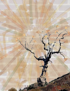
This is my third project for my Digital Media class. We had to create a concept and use scanned object in order to carry out that concept efficiently.  I took a ClipArt image (tree) from the Internet and used that as my main focus.  I scanned in leaves and transformed them to look as if they were on the ground. I scanned in colored pencils and created a radial effect with multiple layers and lowered the opacity.  The background is composed to a lowered opacity of a photograph of brick and scanned tea stains with lowered opacity.  The "leaves" on the tree are actually small pencil shavings that I also scanned in.  All in all, I think that my final project is a little plain, but simplicity is better.  I am content with the outcome. 
This project was made in Adobe Photoshop.

Stay Tuned!
SamanthaMae

Wednesday, October 14, 2009

Robert Rauschenberg


One of my all-time favorite artists and inspirations is Robert Rauschenberg. He mixes screen printing with paint to produce a montage/mixed media effect that is very intriguing. He deals with pop art as well and sometimes focuses on political issues such as JFK. Since he uses many layers in his pieces it can create the effect of texture (which is my favorite way to portray art).  Sadly, he died in 2008, but he contributed so much to the art world. Check out his work, you'll be amazed. 

Stay Tuned!
SamanthaMae


Photo Concepts


These are three shots that I did for my second Digital Media project. The left one produced the concept of Stop Action by using a very high shutter speed to "freeze the motion".  Jordan was my model (kudos to her for doing a job well done. The middle one dealt with Panning (by following the subject at the same pace while the background is blurred). Mittens was my model (kudos to him). This is the best cat in Old New Castle! MEOW! And finally the right photo was a foreground shot. This was taken in Morris Library. 

Stay Tuned!
SamanthaMae

The Grudge Girl

This is the self portrait that I handed in for a Digital Media project. I know, it looks really creepy, sorta like The Grudge girl, but I always wanted to do a shot like this. I think the black and white does it justice. If it was in color it would look so goofy. We also had to have two other shots for our self portrait, but I was not too fond of them myself. 

Stay Tuned!
SamanthaMae

Introduction

Welcome! I noticed that I can only post blog comments on those who have the same blog website as me, so I decided to create a BlogSpot in addition to the DeviantArt blog that I already have. I will be adding blogs and some of my work when I get the time (which probably will be sparatic since I have so much art work to do). I hope to put some of my inspirations on there as well. Stay Tuned!
XOXO
SamanthaMae